Statement of inquiry: How can the World Wide Web be used as an advertising tool?
- The internet has now become a very popular thing in today's world. Online advertising is a form of advertisement which uses the internet to get a promotional message across to consumers. If you advertise online, you do have a lot of competition because thousands of companies advertise online. There are many ways that you can advertise online such as, before YouTube videos, on the sides of pages such as Facebook and also pop-up ads.
- The real life global issue I have chosen is smoking. I have chosen this issue because we see it everywhere, but we always underestimate what it does to us. Tobacco use causes more than 5 million deaths per year worldwide. Current statistics show that tobacco will cause over 8 million deaths every year by 2030. The number of smokers have been decreasing in countries like the US and UK but in other developing countries, smokers are slowly increasing by 3.4% each year. According to the Gates Foundation, people in Bangladesh spend 10 time as much on tobacco as they do on education. Around the world, smoking related diseases kill 1 in 10 adults. Diseases caused by smoking include, cancer, heart disease and lung diseases which includes emphysema, bronchitis, and chronic airway obstruction. On average, smokers die 13 to 14 years earlier than non-smokers. In the US alone, which contains 5% of the worlds smokers, the tobacco industry spends nearly $36 million on advertising and promotions per day.
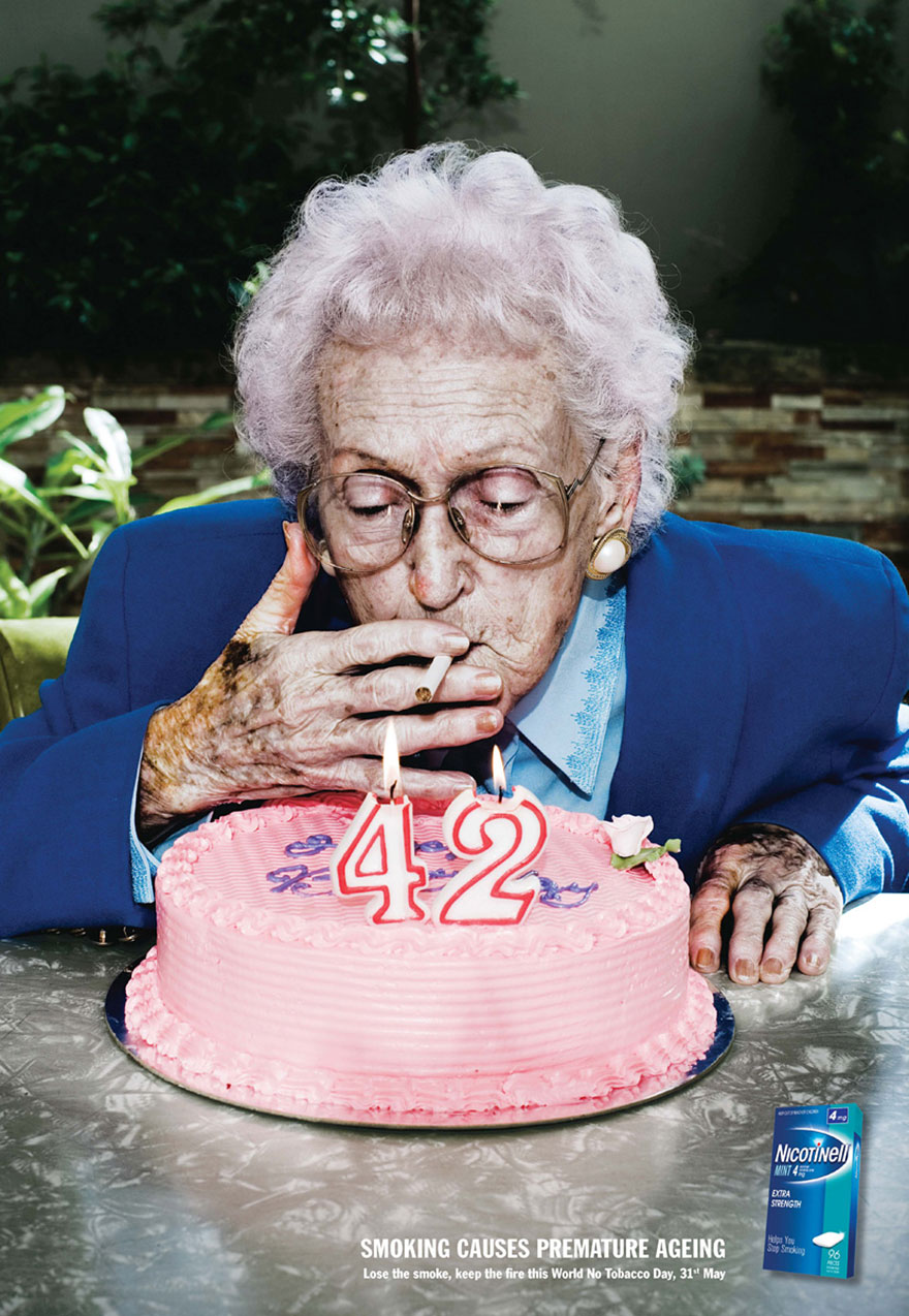
Smoking causes premature aging.

Smokelines are available to help people.

Ways of advertising:
- Newspapers
- Brochures
- Magazines
- Blogs
- Websites
- Videos
- On the television
- Billboards on the roads
- Radio
All these are great methods of advertising a product or a message and to spread my message, that smoking kills, I will be making a website using Dreamweaver. I feel like this is the best and most efficient method because of the amount of people that spend their time on the internet these days. There will probably be a higher chance of someone viewing an advertisement online that in a newspaper.
Brainstorm:

What I want on my website?
Page one: What is smoking? - Explain smoking, show videos (maybe interviews with smokers) and pictures (visual aid).
Page two: Effects on smoking - Show statistics and what diseases it causes.
Page three: Smoking in real life - How smoking is advertised, how anti-smoking is advertised. Show pictures and examples of different advertisements.
Page four: Overcoming smoking - What will happen if you overcome smoking, how you can stop smoking, is it easy?
Extra:
- Pictures
- Videos
- Attractive colors
- Pretty font
- Interesting content
What I need to ask myself after creating my website:
- Is my website design attractive?
- Is the information interesting?
- Is there too much information - too many words?
- Is there enough visual aid - pictures, videos etc.
- Are there too many things on the website that makes it look cluttered?
- Am I getting my message/point across to the reader?
- Does the font or background color distract the reader's eye?
- Can I add anything else to get my point across?
- Is my information off track - is it relevant?
- Is the layout pleasing to the eye?
References:
en.wikipedia.org/wiki/Smoking
"Main Page." Wikipedia. Wikimedia Foundation, n.d. Web. 08 Feb. 2015.
www.cdc.gov/tobacco/data_statistics/fact.../effects_cig_smoking/
N.p., n.d. Web. 9 Feb. 2015.
www.nlm.nih.gov/medlineplus/smoking.html
"Smoking: MedlinePlus." U.S National Library of Medicine. U.S. National Library of Medicine, n.d. Web. 09 Feb. 2015.
https://bubbl.us/ - Brainstorming app
easybib.com - MLA formatting website.
- The real life global issue I have chosen is smoking. I have chosen this issue because we see it everywhere, but we always underestimate what it does to us. Tobacco use causes more than 5 million deaths per year worldwide. Current statistics show that tobacco will cause over 8 million deaths every year by 2030. The number of smokers have been decreasing in countries like the US and UK but in other developing countries, smokers are slowly increasing by 3.4% each year. According to the Gates Foundation, people in Bangladesh spend 10 time as much on tobacco as they do on education. Around the world, smoking related diseases kill 1 in 10 adults. Diseases caused by smoking include, cancer, heart disease and lung diseases which includes emphysema, bronchitis, and chronic airway obstruction. On average, smokers die 13 to 14 years earlier than non-smokers. In the US alone, which contains 5% of the worlds smokers, the tobacco industry spends nearly $36 million on advertising and promotions per day.
Smoking causes premature aging.
- Is my website design attractive?
- Is the information interesting?
- Is there too much information - too many words?
- Is there enough visual aid - pictures, videos etc.
- Are there too many things on the website that makes it look cluttered?
- Am I getting my message/point across to the reader?
- Does the font or background color distract the reader's eye?
- Can I add anything else to get my point across?
- Is my information off track - is it relevant?
- Is the layout pleasing to the eye?
References:


